Brand Management: Keep Your Creative Work Professional
by Ben Quinn
Pablo Picasso and his Cubism style of art is known throughout the world by the art illiterate and aficionados alike. His captivating work distorts reality and explores composition in ways that were not only ground breaking, but are considered by many as genius. What most people don’t know is that Pablo Picasso was a superb realist painter. It was only through years of experience, study, and practice that Picasso was able to achieve greatness by simplifying and breaking down his compositions into masterpieces. What does this have to do with buying logos, or brand management for that matter?
“Learn the rules like a pro, so you can break them like an artist.” – Pablo Picasso
We live in a world where boards of beautiful art stream into your smartphone accompanied by 140 characters or less. It’s easy to forget that truly inspiring, thought-provoking work is usually the result of a lifetime of dedication. With so many out-of-the-box website designs and crowd-sourced logos available, it’s easy to see why companies take this approach. Unfortunately, this also sets the low bar by which most brands are measured — and managed.

There are many high-quality compositions out there, but if there is no story, no personality behind your logo, then it’s just an image. It’s not representative of the hard working people behind it.
When asked, most companies claim their product is superior to their competitors’. But think about it: it’s through the learning process, mastery and challenge of real work that superior products reveal themselves. The same is true for the brand you put forth. Anyone can buy a logo, but truly refined brands know to employ creative minds that take the time to get to know their clients. Copywriters and designers that put in sweat equity get to know the core of their client’s abilities. These are the ones that take a brand from good to great. Hard work and dedication starts in research, then flows over to the next steps of brand management, and trickles into each and every project. The ultimate result? A thoughtful, cohesive brand.
So when choosing your approach to brand management, build a relationship with a marketing team that will put in the work. Only then will you be able to break the established rules effectively and stand apart from your competition.
Continue ReadingA Lesson on Creative B2B Campaigns from MailChimp
by MGB2B
UPDATE: We know an awesome campaign when we see it, congratulations to MailChimp for scoring a Cyber Grand Prix at Cannes Lions 2017. This campaign was recognized for being the best example of a full-blown campaign with digital at the center.
Mail Shrimp? Fail Chips? Snail Primp? What could all of these wacky phrases have in common? They’re all part of MailChimp’s new advertising campaign “Did You Mean MailChimp?” The campaign flies in the face of any preconceived notion that you need to play it straight with B2B ads.
Founded in 2001, MailChimp quickly made a name for itself in the email marketing software industry. Known for their easy-to-use email templates and quirky monkey mascot, Freddie, MailChimp is a top competitor in the B2B email marketing sphere. However, they’ve never made an advertising splash on a national scale, until this campaign.
It All Started With A Meme
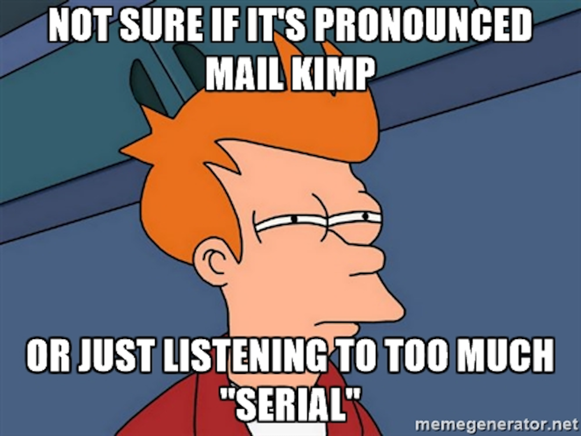
The “Did You Mean MailChimp?” campaign was inspired by an ad that ran during the popular podcast, Serial, where the announcer famously mispronounced the word MailChimp. Hundreds of memes like the one shown above popped up online. MailChimp wondered: what other weird things sound like MailChimp? From there, the entire campaign blossomed.
Random Products and Trends… Not So Random After All
MailChimp launched the campaign with three quirky, but mesmerizing short films: JailBlimp, MailShrimp, and KaleLimp. After the kickoff, the brand began to set other components in motion. Taken individually, they seemed like random trends or disconnected products at the time, but for those in the know, everything was cleverly connected.
One seemingly random execution was MaleCrimp: a fake fashion trend of men with crimped hair. The brand teamed up with Paper Magazine and published a photo story online called “Cool Kids Crimp” right before New York Fashion Week. It also linked to the Tumblr MaleCrimp page, with some sly MailChimp branding at the bottom.
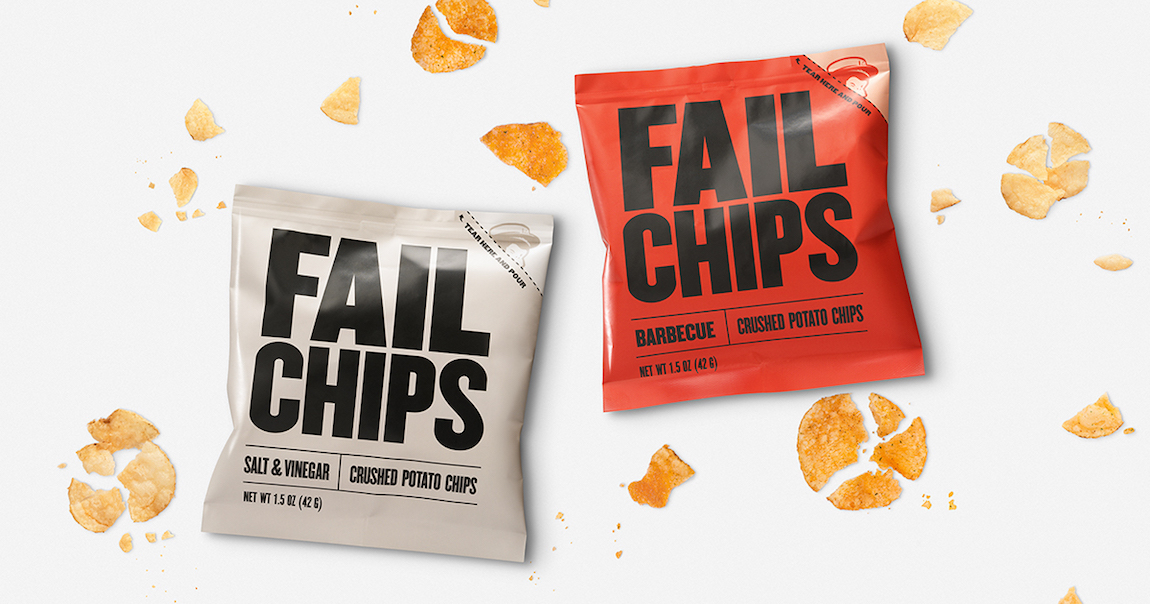
Another example of an over-the-top execution is FailChips. This new chip brand popped up throughout New York, offering a new brand of chips that consisted of the crunched pieces at the bottom of a bag of chips. Upon closer inspection, the packaging had the MailChimp monkey printed on the outside of the bag.
These are just a few examples of seemingly random executions, that were not so random after all. Overall, MailChimp put out eight executions of the campaign.
Why Did This Work?
There’s nothing traditional about this campaign whatsoever, but it worked. Why?
From their inception, MailChimp has established themselves as unique; among the many email software companies vying for the attention of businesses, MailChimp has firmly planted their brand flag, saying “this is who we are.” Yes, this may scare away some potential clients, but that’s okay.
MailChimp didn’t need a direct marketing campaign; they’re already known to be a top player within their industry. What they needed was an out-of-the-box brand awareness campaign that elevated MailChimp to a larger stage and let consumers know who MailChimp is, on a personal level.
Quirky, creative, funny, modern, original – these words describe both the campaign and MailChimp’s company values and brand personality. And it makes them unforgettable, even in the B2B world.
Continue Reading


