by MGB2B

The Myth: Customer Service Has Nothing to Do with My B2B Brand Identity
The Truth: Building Brand Loyalty Requires Robust Support and Engagement
A brand is more than just a logo or a message on a company website. A brand is a combination of several different things, including the way a business interacts with its clients and how the clients feel about the product or service. If it’s been taking a back seat in your marketing strategy, it’s time to consider how customer service for B2B brand identity can help.
Customer service is not a just a department.
Many companies make the mistake of thinking that once a transaction is made, their job is done. But brand building doesn’t stop when the sale is complete. Following up with customers and maintaining a relationship with them is just as important. It ensures that your customers feel positively about your business, encourages them to come back, and even creates raving fans that will market your product for you. Positive brand perception requires authentic interactions that engage. Your marketing strategy should rely on customer service for B2B brand identity to accomplish it.
There are several different strategies for continuing to interact with your client base to earn their trust and build brand loyalty:
- Define yourself through action.Ultimately, the quality of your business is determined by your actions. Clearly identify your company’s purpose and customer support standards. This culture code should be carried out through every level of your company, from top to bottom. In today’s world, it’s not just about what your brand says — it’s about what you do.
Be transparent and available. This is your opportunity to show customers they can rely on you. Be reachable by phone, email, or social media when other companies aren’t. Contact information should be easily available, especially a call center number. This lets customers know there are real people behind your brand — an online FAQ page just isn’t sufficient. Further more, these interactions display what your company is about, and determines what customers say about your business. Own up to any mistakes, and make sure that every support call ends successfully.
- Engage on social media. Most business are active online, so use this to your advantage. Engage in genuine conversation with your customers on social media. Personal messages and replies are most likely to increase brand loyalty and awareness. Online communities aren’t just for consumers — businesses also turn to the internet to ask questions, provide answers, and share knowledge about a product or service.
- Encourage feedback. Finally, every brand needs a system to track customer feedback. The most successful companies are often marked by their willingness to let customers speak out about their experiences — positive or negative. Making a customer feel acknowledged will build their trust and help you understand where you might not have met a their expectations.
Customer service is often looked at as something specific only to consumer brands. It’s also the task that many B2B companies dread handling. However, it’s just as important for B2B. Use it to your advantage and elevate the perception of your brand. Start to amp up your customer service for B2B brand identity, and companies will continue to bring their business to you time after time.
Continue Reading
by MGB2B

There are a lot of variables you need to think about when building a website. Layout, page flow, content, photo choices, CMS, hosting, the list goes on. But a major part of the design you need to keep in mind from the get go is the overall color scheme of the site. Below are a few key items to keep in mind when deciding on a color scheme for your new (or redesigned) website.
Color Psychology
Every color has built in associations for people. Those associations can vary widely in different cultures – but lets stick to the US for now. The use of color on your website helps set the mood for the user ‘s experience, affects how long they stay on your site, and helps drive them to action.
People associate blue with serenity, security and trust. Green can mean renewal, growth and nature. And red, the most eye catching of all the colors, can create feelings of action and danger. Colors not only have their own associations amongst cultures. They have specific associations with marketing due to the influence of the big multinational corporations we all know and love. See an interesting piece about this on ColorPsychology.org. These color associations should be taken into consideration with all design elements on your site, icons, call out boxes, and even the shades of color in the photography you are using.

Brand Consistency
Another major consideration: how does your website match up with your overall brand identity? Your brand identity should not just be taking a look at the colors in your logo. Sit down with all your marketing materials to see what a viewer of your website has possible already seen. Does the general color tone of your new website match the look of the email campaigns a client may have seen? Does it look similar to your print ad or Sell Sheets? If you spread all the work out on your desk, you should notice a theme. If not, and your desk now looks like a rainbow, then maybe you have other things than your website to think about.
Buttons and CTA’s
I have been talking a lot about color consistency. However, since rules are meant to be broken, the Call’s to Action and Buttons on your website are the perfect place to do it. You want your website to make sales, generate new leads, and in general perform well. If the items on your website that drive this blend in too much, you are missing an opportunity to convert viewers into sales.
Here’s the tricky part: using color to create buttons that stand out, but don’t look gaudy. This can actually downgrade the quality of your brand. The easiest way to figure this out is through a tool that you may remember from elementary school art class – the color wheel.

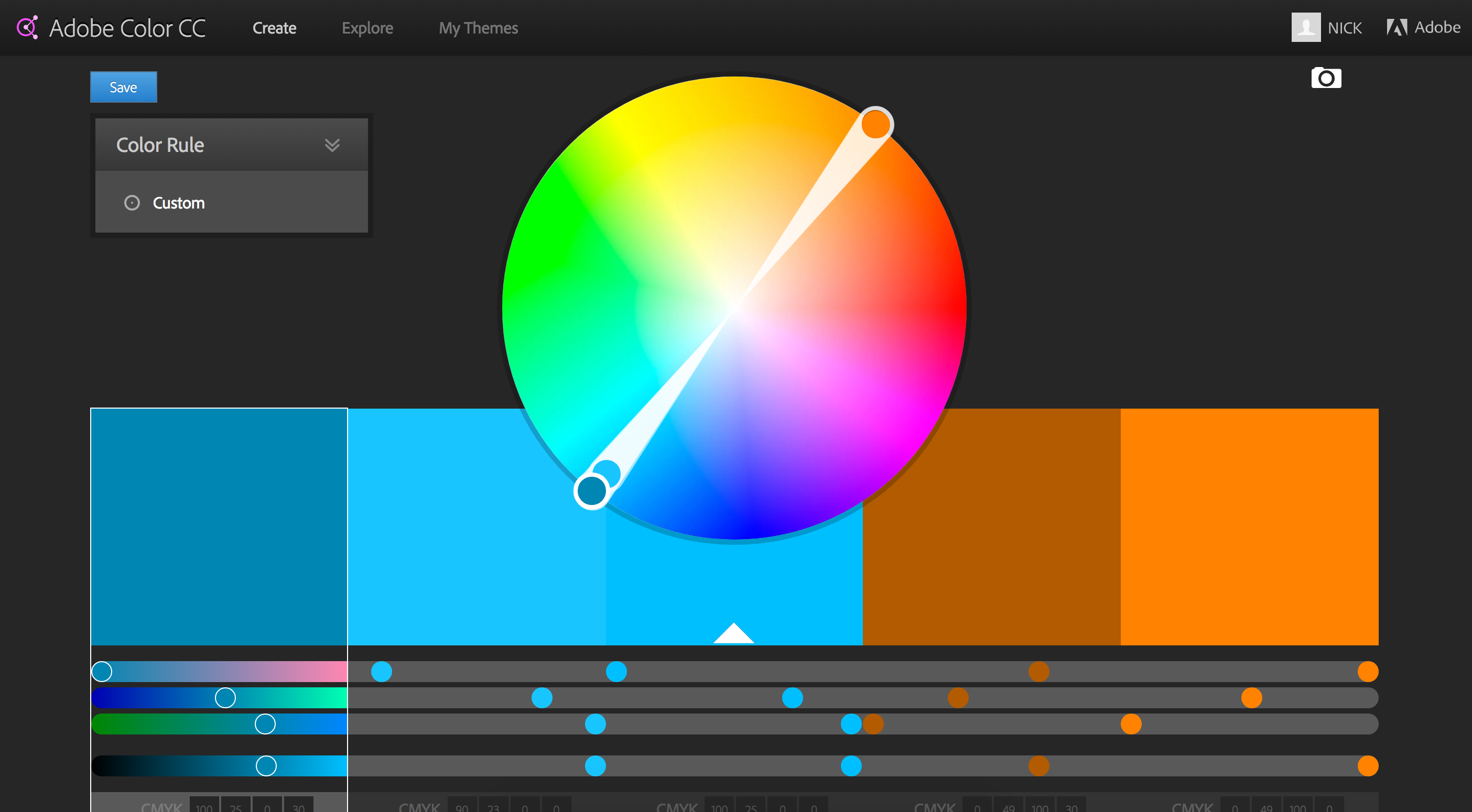
Your corporate color is your starting point. Then, I suggest you pick a either a complimentary, analagous, or split complimentary color scheme. This comes down to basic theory ideas. As you can see in the example above, a complimentary color scheme chooses the colors exactly opposite on the color wheel. Complimentary colors make a stark difference that will help your highlighted buttons really stand out. (Side note: beware of Red/Green combos that look very Christmasy if you are not careful). An analogous choice selects the colors directly adjacent to your brand color and is a much more subtle selection. And finally a split complimentary color scheme is a nice balance between the first two choices – it’s the two colors adjacent to your brand’s complimentary color. This helps make buttons and CTA’s stand out, but keep them from being jarring.
Complimentary Colors In Action
Merrill Corporation, the winner of the 2016 B2B Web Award. This is a good example of a site using a complimentary color scheme with blue as their corporate color and using orange as a highlight color for all their buttons.

In the end, there are endless directions you can take with the color scheme of your website. There are also lots of resources online to help with the process. At the onset of any major branding project, I often find myself turning to Adobe Color CC – great part of the Adobe Suite of products. This tool allows you to develop your own color schemes and to explore those of other Adobe users who have shared theirs. It is a great place to start.

Continue Reading
by Emily Swet

Instagram usually isn’t a first priority for B2B marketing and sales teams – and it’s easy to see why. In a platform teeming with rich visual content, it seems a playing field best suited for B2C brands. Set that skepticism aside, because as we like to remind you, there’s still a human behind your leads, and B2B Instagram marketing campaigns can be incredibly compelling.
To get the ball rolling, think about how you view your B2B brand itself. When you start to view your brand (as well as your buyer personas) as a unique group of people with individual stories, backgrounds, and interests, you can craft a visual message that resonates. And that opens the door for a whole lot of visual opportunity and engagement.
Check Out These B2B Instagram Marketing Campaigns for Inspiration:
1. Maersk Line – Shipping Containers. Angle: Aspiration

Who would have thought a shipping container company could get 64k+ followers? Maersk uses striking travel photos and ship imagery to resonate a narrative of world interconnectedness and communication – that they “move more than cargo.”
2. MailChimp – Email Marketing Service. Angle: Artsy, Irreverent, Anything But Boring.

This small business email marketing service could be a snooze fest. But a well-timed podcast advertisement tapped them into where they wanted to be, and an Instagram sensation was born. As one of their comments reads: “Your campaigns are [thumbs up]. I would use Mailchimp just because it’s fun and artsy.” And that says it all.
3. Fedex – Global Shipping. Angle: Affinity

Fedex is already a household name, so the focus here is instead on sustaining brand affinity. Sending cargo never seemed so lofty or fun – and we see how Fedex is always there, rain or shine, in all corners of this beautiful planet.
4. Adobe – Software. Angle: Product Showcase

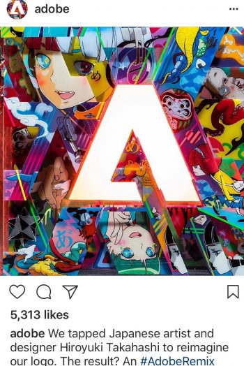
This one is a no-brainer. With a product that lends itself to visual design, Adobe can really stretch its content legs – and it does. They emphasize their product capability with a striking display of visuals that inspire designers of all levels to give their products a go.
5. HP – Technology. Angle: Cutting Edge

HP is another brand that doesn’t need to put much effort into brand recognition. Instead, their approach is a cutting edge image. From virtual reality at Coachella, to gorgeously curated product shots, to technology that’s as fashionable as the models holding them, it’s clear HP lives on the edge of what’s hot now – and what’s next.
The time is ripe for your B2B brand to get on board with Instagram, but we advise you to move fast – early adopters have a much easier go at grabbing attention because the space isn’t crowded… yet. Need help developing an Instagram strategy? Drop us a line – we can help you with that.
Continue Reading


