The Importance of Color on Your Website
by MGB2B
There are a lot of variables you need to think about when building a website. Layout, page flow, content, photo choices, CMS, hosting, the list goes on. But a major part of the design you need to keep in mind from the get go is the overall color scheme of the site. Below are a few key items to keep in mind when deciding on a color scheme for your new (or redesigned) website.
Color Psychology
Every color has built in associations for people. Those associations can vary widely in different cultures – but lets stick to the US for now. The use of color on your website helps set the mood for the user ‘s experience, affects how long they stay on your site, and helps drive them to action.
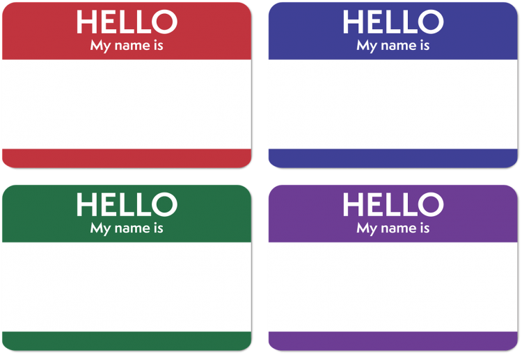
People associate blue with serenity, security and trust. Green can mean renewal, growth and nature. And red, the most eye catching of all the colors, can create feelings of action and danger. Colors not only have their own associations amongst cultures. They have specific associations with marketing due to the influence of the big multinational corporations we all know and love. See an interesting piece about this on ColorPsychology.org. These color associations should be taken into consideration with all design elements on your site, icons, call out boxes, and even the shades of color in the photography you are using.

Brand Consistency
Another major consideration: how does your website match up with your overall brand identity? Your brand identity should not just be taking a look at the colors in your logo. Sit down with all your marketing materials to see what a viewer of your website has possible already seen. Does the general color tone of your new website match the look of the email campaigns a client may have seen? Does it look similar to your print ad or Sell Sheets? If you spread all the work out on your desk, you should notice a theme. If not, and your desk now looks like a rainbow, then maybe you have other things than your website to think about.
Buttons and CTA’s
I have been talking a lot about color consistency. However, since rules are meant to be broken, the Call’s to Action and Buttons on your website are the perfect place to do it. You want your website to make sales, generate new leads, and in general perform well. If the items on your website that drive this blend in too much, you are missing an opportunity to convert viewers into sales.
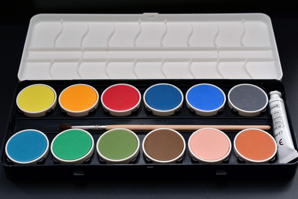
Here’s the tricky part: using color to create buttons that stand out, but don’t look gaudy. This can actually downgrade the quality of your brand. The easiest way to figure this out is through a tool that you may remember from elementary school art class – the color wheel.

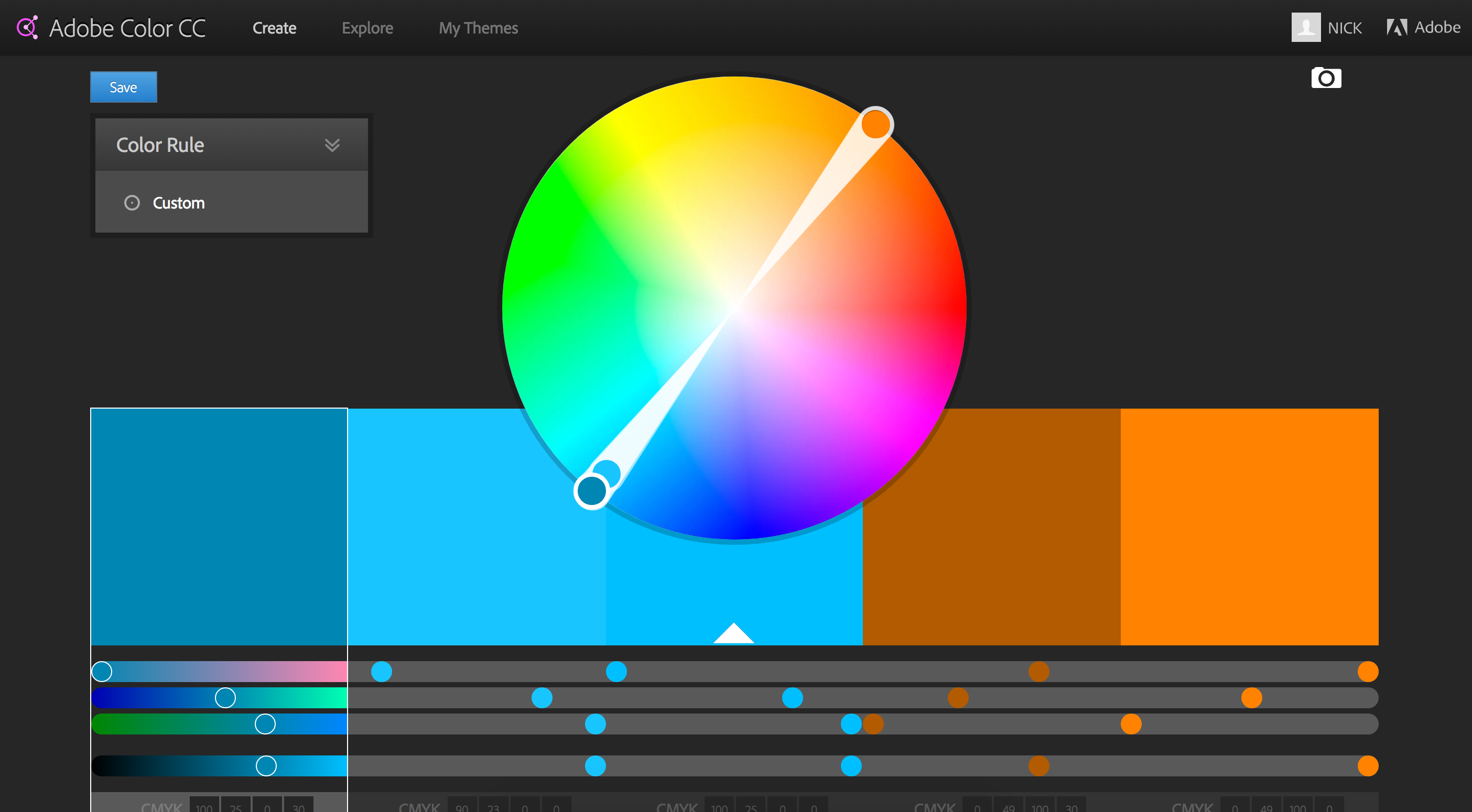
Your corporate color is your starting point. Then, I suggest you pick a either a complimentary, analagous, or split complimentary color scheme. This comes down to basic theory ideas. As you can see in the example above, a complimentary color scheme chooses the colors exactly opposite on the color wheel. Complimentary colors make a stark difference that will help your highlighted buttons really stand out. (Side note: beware of Red/Green combos that look very Christmasy if you are not careful). An analogous choice selects the colors directly adjacent to your brand color and is a much more subtle selection. And finally a split complimentary color scheme is a nice balance between the first two choices – it’s the two colors adjacent to your brand’s complimentary color. This helps make buttons and CTA’s stand out, but keep them from being jarring.
Complimentary Colors In Action
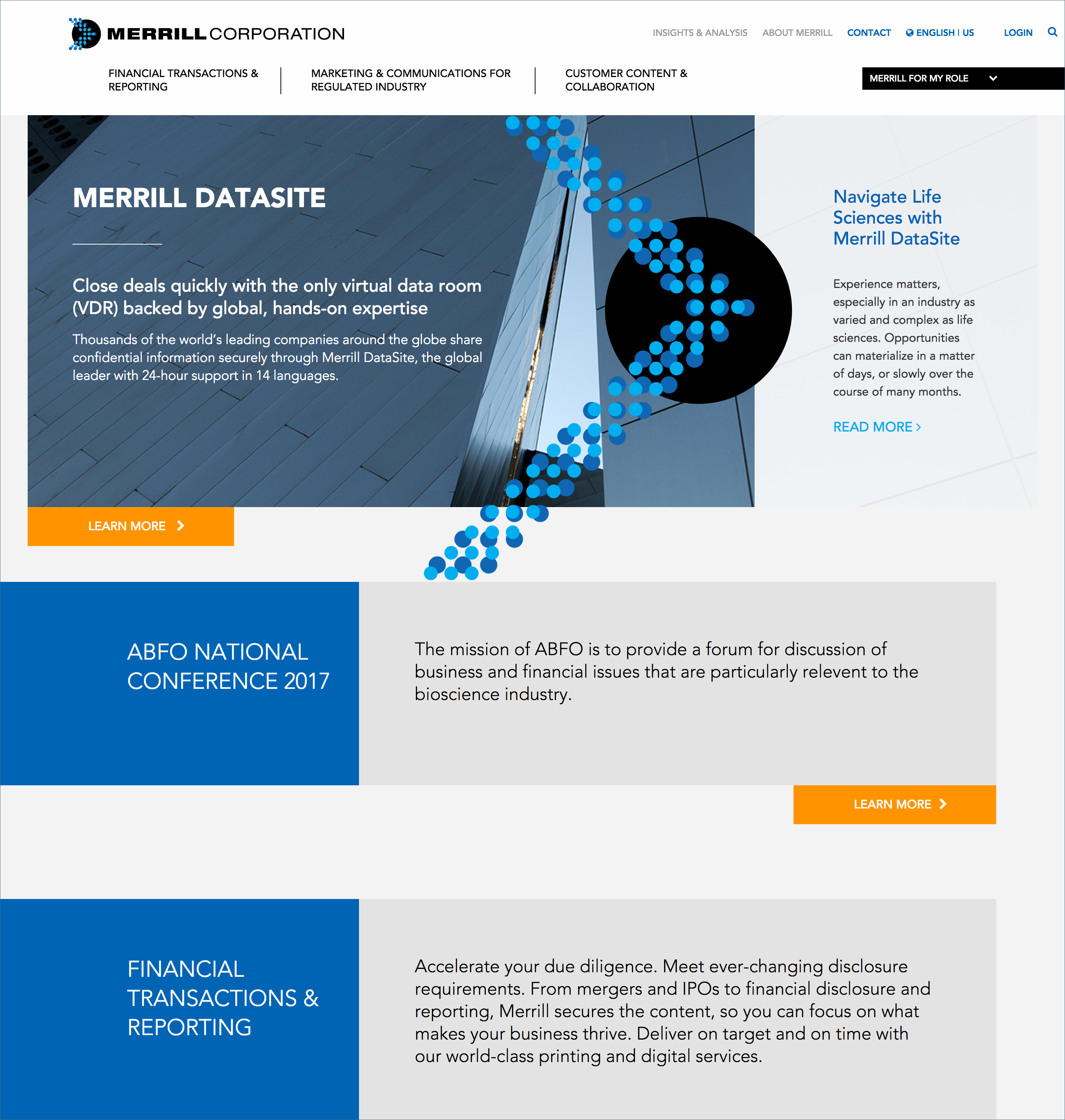
Merrill Corporation, the winner of the 2016 B2B Web Award. This is a good example of a site using a complimentary color scheme with blue as their corporate color and using orange as a highlight color for all their buttons.

In the end, there are endless directions you can take with the color scheme of your website. There are also lots of resources online to help with the process. At the onset of any major branding project, I often find myself turning to Adobe Color CC – great part of the Adobe Suite of products. This tool allows you to develop your own color schemes and to explore those of other Adobe users who have shared theirs. It is a great place to start.

B2B Monday Myth: B2B Web Design is All About Pretty Pictures
by MGB2B
The Myth: Web Design is All About Pretty Pictures
The Truth: B2B Web Design Needs to Properly Guide your Audience Throughout the Site
When it comes to B2B web design, the challenge has nothing to do with the pretty pictures and crazy font. Instead, it has everything to do with the process and functionality that guides your audience through the site.
User Experience
In order to do so, there needs to be a strong focus in user experience. A good user experience has to include accurate and relevant call-to-action buttons and website functionality – this is a non-negotiable. Website functionality isn’t about pretty pictures, like many may think. A clean and focused webpage format draws attention to the site and leads users to where you want them to go.
Also included in user experience is a strong message that is portrayed throughout the site. A lack of message (or an unfocused one) confuses your audience as to what your company does. A strong company message builds trust and lets users know what your company is all about. Your B2B web design must focus on strong messaging throughout the entire site in order to give your audience a sense of understanding – which will ultimately keeps them interested.
Call-to-Action
It is important to have the right call-to-action buttons throughout a site to drive people to a contact page and capture them as a lead. In order to drive people to a contact page, your B2B web design blueprint needs to include easy access to your lead generation form. Basically, if a user has to dig for a way to contact you, the website isn’t guiding your audience. And your user has to already have intent – and patience. A better user experience on your B2B page leads users to easy-to-find contact pages, which means higher conversion results.
The more CTA buttons you have, the better your results are likely to be. Repetition is key. Instead of just having one call-to-action button on the top of the website, it is beneficial to include them on the bottom of each page as well.
Lead Generation
Once your website is designed to accurately and effectively guide users through your site, more and more visitors are able to be converted into leads. After that, you can determine whether the call-to-action buttons helped to generate a lead. Then, you can see how they interact with your brand and determine whether the lead becomes “qualified”.
While pictures are eye catching, they do not create leads. If your B2B web design accurately guides your audience throughout your site with strong functionality and properly placed call-to-action buttons, there is a very strong chance that more users will interact and become interested in filling out a contact form to learn more.
Continue ReadingA Rose by Any Other Name? 4 Signs It’s Time To Rename Your Manufacturing Company
by Emily Swet
 Is your B2B company suffering a failure to thrive? Don’t underestimate the power of your name. And when it comes to rebranding, don’t underestimate how detrimental a bad name can be, either. B2B companies are quick to list reasons why their businesses are stalling – limited marketing budgets, saturated markets, changing demands – but rarely do they associate a bad name with a stalled out company. It’s just a name, right? The thing is, even though you are selling to another business, you’re still marketing to another human being. And words have meaning. (You know, the whole pen mightier than the sword thing? Yeah, that.) So how do you know if it’s time to rename your manufacturing company? Here’s a cheat sheet.
4 Signs That It’s Time to Rename Your Manufacturing Company
- Your name is too plain. Basic names only work when you 1) are the first company in the field, and 2) have years to establish yourself, like General Electric. But imagine if a company like Amazon had been named GeneralOnlineRetailer.com. They would have been hard-pressed to stand out in the online boom of the 1990’s. (Amazon has an interesting naming story, by the by.) Take note of your competition and your standing before you choose a name like “Universal Plumbing Standards Corp.”
- Your name is meaningless to anyone but you. Initech, anyone? We understand that there are some names that have inside meaning or a rich personal history for your B2B company. But what does that mean to an outsider? It’s this logic that lead Quantum Computer Services to change their name to America Online, which directly translates their product and elicits an emotional response. Unless your name resonates your brand positively on an emotional or literal level, it’s just white noise.
- Your name is hilarious… and not in a good way. We’ll just glance at Analtech, who despite a near 50 year legacy, is rebranding to iChromatography – which not only explains what they do, but keeps those pesky web filters from blocking them in search.
- Your name is scandalous. It’s no surprise when a company like ValuJet has to rename and rebrand to AirTran after their crash in 1996. But if your business, innocently (and coincidentally) enough, happens to be called Lewinsky Auto Supply, it might suffer simply from association.
The right name for your brand will both value your heritage and leverage your position. Think it might be time for you to rename your manufacturing company? Drop us a line.
Continue Reading
